grow lash
logo + packaging design
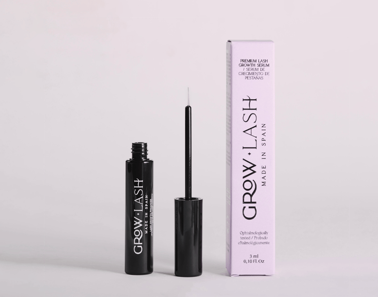
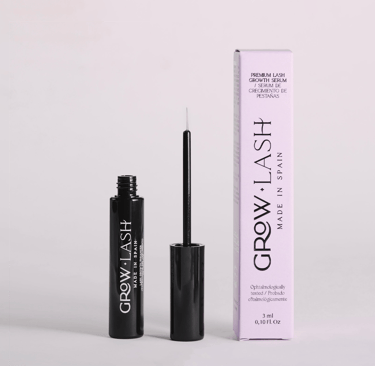
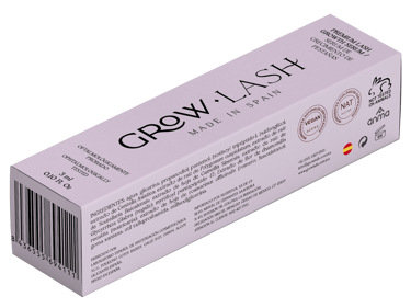
Logo Design The GROW LASH wordmark employs elegant serif typography with extended vertical letterforms that subtly echo the desired product result—longer, elevated lashes.
The diamond separator between "GROW" and "LASH" adds a luxury jewelry-like detail, elevating the brand beyond typical cosmetics into the premium beauty category. "MADE IN SPAIN" reinforces European quality standards and manufacturing prestige.


Packaging Strategy
The design leverages stark contrast to communicate dual benefits: the glossy black bottle conveys luxury, drama, and the transformative power of enhanced lashes, while the soft lavender box introduces a feminine, gentle touch that balances clinical credibility with beauty appeal.
Clean typography and generous white space on the packaging reflect the precision and care expected from a premium cosmetic treatment.
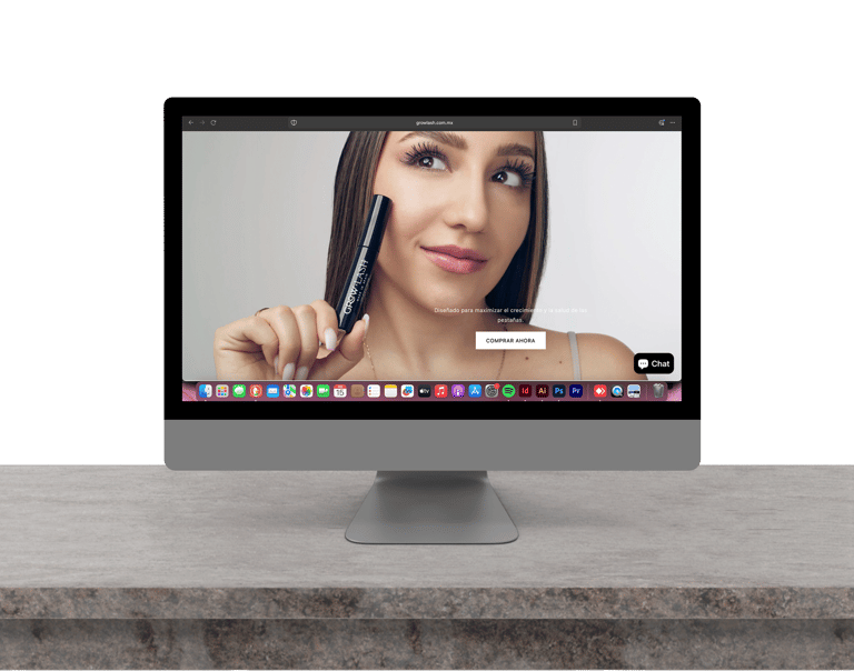
The overall aesthetic positions GROW LASH as a prestige product—sophisticated enough for luxury retail environments while maintaining the approachability and femininity essential to beauty product success.