virescent essentials
logo + packaging design


About the project
Aesthetics. naturalness and natural materials all come together in their philosophy.
Nature is beautiful in its natural state and every woman is just as beautiful and incredible.
The delicate balance of naturalness and modern technology had to be emphasized and preserved.
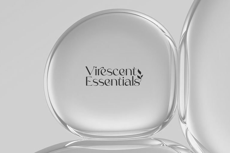
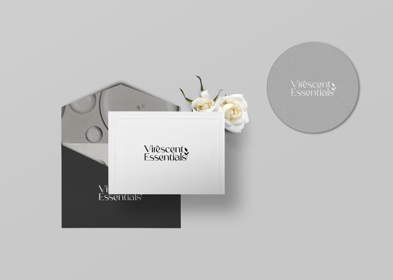
About the logo
The serif font conveys sophistication and timelessness—reflecting that natural beauty is eternal, not trendy. The elegant, thin letterforms communicate delicacy and refinement without being overly ornate, which mirrors the brand's philosophy of "naturalness" without excess.
The Leaf Icon Integration The small botanical element integrated into the logo serves multiple purposes:
Direct connection to nature and organic origins
Suggests growth, vitality, and living ingredients
Positioned subtly rather than dominantly—emphasizing the "delicate balance" between nature and modern formulation technology
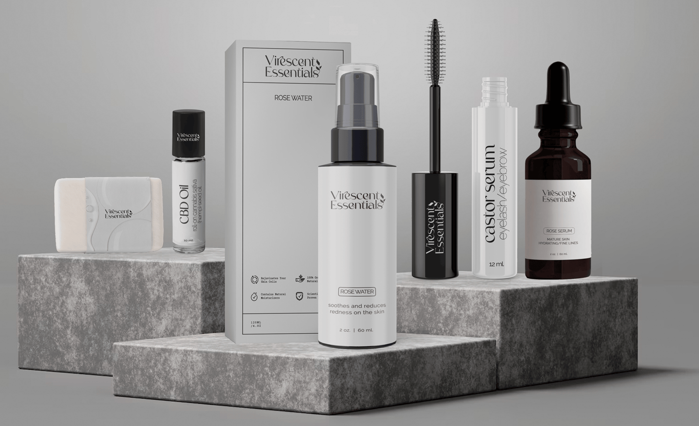

About the packaging
Typography & Label Design Minimalist labeling with ample white space reflects:
Confidence in product efficacy
Clean ingredient lists
Premium positioning
Easy readability